
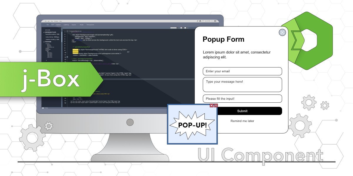
The j-Box component from the Total.js jComponent UI library is a versatile tool for creating customizable pop-up windows, such as forms or galleries. This blog demonstrates its setup, attributes, and integration with other components, using examples to show how to build pop-up forms with menus, content, and buttons.
j-Box is part of the jComponent UI library from Total.js. You can find more information about j-Box on componentator.com or GitHub.
j-Box is a great flexible UI component, that can be used to implement a wide variety of pop-up windows to your web application. You can use it for forms, tooltips, notices, galleries, or whatever you need as a pop-up window.
In the previous blog post, I wrote about j-Importer and already showed you a little bit of j-Box. In this blog, we will continue with the code from the previous blog, because we prepared there j-Importer for our j-Box. So if you are new here, please read the previous blog before, to fully understand the connections here and why we used both components together.
Because we want to use j-Box as a pop-up window for an example form, we will create it as a new HTML file. This file we put in the forms folder in our directories and it will be imported by j-Importer, when we click on the button we already prepared in the previous blog. This HTML file can have HTML parts, styles, and also JavaScript PLUGIN for itself.
How to use j-Box
As the first step you have to know how to use the jComponent library. I wrote about it in my previous blog, so for more information please read this blog post about jComponent.
Initialization
We can initialize more j-Box components if we need them, but they have to be in different files if we want to use them separately. In this example, I will show you how to initialize one j-Box, and based on that you will learn, that it is very easy and you will be able to use it further.
You can see in this example the word CLASS in multiple places. It is important to understand, that this word is in this case a reserved word (same as ~PATH~). Both will be replaced in the background for value, from the defined path. In this case, it is a value testform, because we used this path to invoke our j-Box and it is listening on that path.
We used the same HTML tag as for other components - ui-component. We used the same attributes as before, a name with a value box because we want to use component j-Box. Attribute path with value *form where (star) is in the background replaced for path common, so final path is common.form. The last attribute is config with settings if with value CLASS which is a condition for showing the form, it's compared with the value within of the defined path. Setting title with value TEST which is a title for the form. width with a value of 350 which means, that the form will have a width of 350 pixels. submit with value ?/submit, which means, that a function submit from a particular PLUGIN will be invoked after clicking on the button submit. And setting reload with value ?/reload, which means, that function reload from particular PLUGIN will be invoked after reload.
The next attribute is a plugin with the value CLASS, which sets our plugin value to testform because as I wrote before, the word CLASS will be replaced in the background.
The last attribute is class, which is basically a class, and we set their values hidden and CLASS because we want to use this as a unique class for our form. It is good for us when we do not want to mix our styles between different forms and app.

You can see in the code, that this component has its inside divided into three parts.
Menu
The first part is navigation with one button for the menu. This button you can see in the header of our component. You can remove this part, or implement there some pop-up menu with options. For this example, I implemented there menu. This menu is made with the jComponent j-Menu. By clicking on the button Menu, the function menu from our PLUGIN is invoked and a menu will appear. (JavaScript PLUGIN is part of the test.html file, which includes our component j-Box, so this PLUGIN is created exactly for this form and they are part of the same plugin - testform).
With this code, we will get a pop-up menu with two options - Edit and Remove.

Content
The middle part is for content in our j-Box. In the code, you can see, that I wrote there only the word CLASS, but because it is replaced in the background, you can see the testform rendered on the web.
This is the part of the component, where you can put your content. It depends completely on your case if you use it for some information text, gallery, form, or whatever you need.
You can put there for example some jComponent j-Input components and make a form from it. I will take some content from j-Input in componentator.com and I will show you how it will look.

Code used in this example (only replaced middle part):
And because this form has defined also the plugin attribute, all values are now available on this plugin path (testform in this case).
Buttons
The last section is buttons, which are rendered in the bottom part of the form. It is optional for you, you can use both these buttons, remove them, or use only one you need. In this example, I will show you how to use it. In the configuration for the j-Box component we defined, that we want to invoke the function submit after clicking on the submit button. So we have to create this function in our PLUGIN.
Now, after clicking on the submit button we will get text SUBMIT in our console.

You can do the same also for the Cancel button.
Maybe it will help you more if you see the complete code in the test.html file, so I will add it here.

I hope you learned something new with this blog, but do not forget, that this was only for example purposes and you can do a lot more with this component.
Video tutorial
Follow me:
Other posts from Total.js Platform
- 2026-03-02February report 2026
- 2026-02-02January report 2026
- 2026-01-02December report 2025
- 2025-12-15Totally Merry Christmas and a Happy New Year 2026!
- 2025-12-01November report 2025
- 2025-11-02October report 2025
- 2025-10-22New universal drivers for IoT Platform
- 2025-10-13IoT Platform Update: New Features and Enhancements
- 2025-10-01September report 2025
- 2025-09-05How to create Google Gemini AI component in Total.js Flow