
In this post, we’re going to guide you step-by-step through the process of designing a simple interface, so you can experience firsthand how intuitive and fun it is to work with Total.js UI Builder.

Total.js UI Builder: Designing Your First Interface
Welcome back to our Total.js UI Builder series! In the previous post, we explored the basics of this powerful tool. Now, it’s time build something interactive! In this tutorial, we’ll guide you step-by-step through creating a simple but dynamic user interface where a button will reveal a hidden message. And that’s not all. By the end, you’ll be faced with a fun exercise to take your skills even further.
Yes, you're not just building a basic “Hello World” screen, you'll make it interactive by using a button to control when the message appears. This is a great way to learn the basics of component interaction in Total.js UI Builder, and by the end, you'll be ready to explore even more advanced features.
Once you've completed the tutorial, let the community know what you think! Join the conversation in the Total.js Telegram group and share your thoughts on the UI Builder in the dedicated topic.
Step 1: Accessing the Total.js UI Builder
To follow along, we’ll use the online UI Builder, which is free and requires no installation. Head over to uibuilder.totaljs.com. You’ll see a straightforward interface where you can start designing immediately.
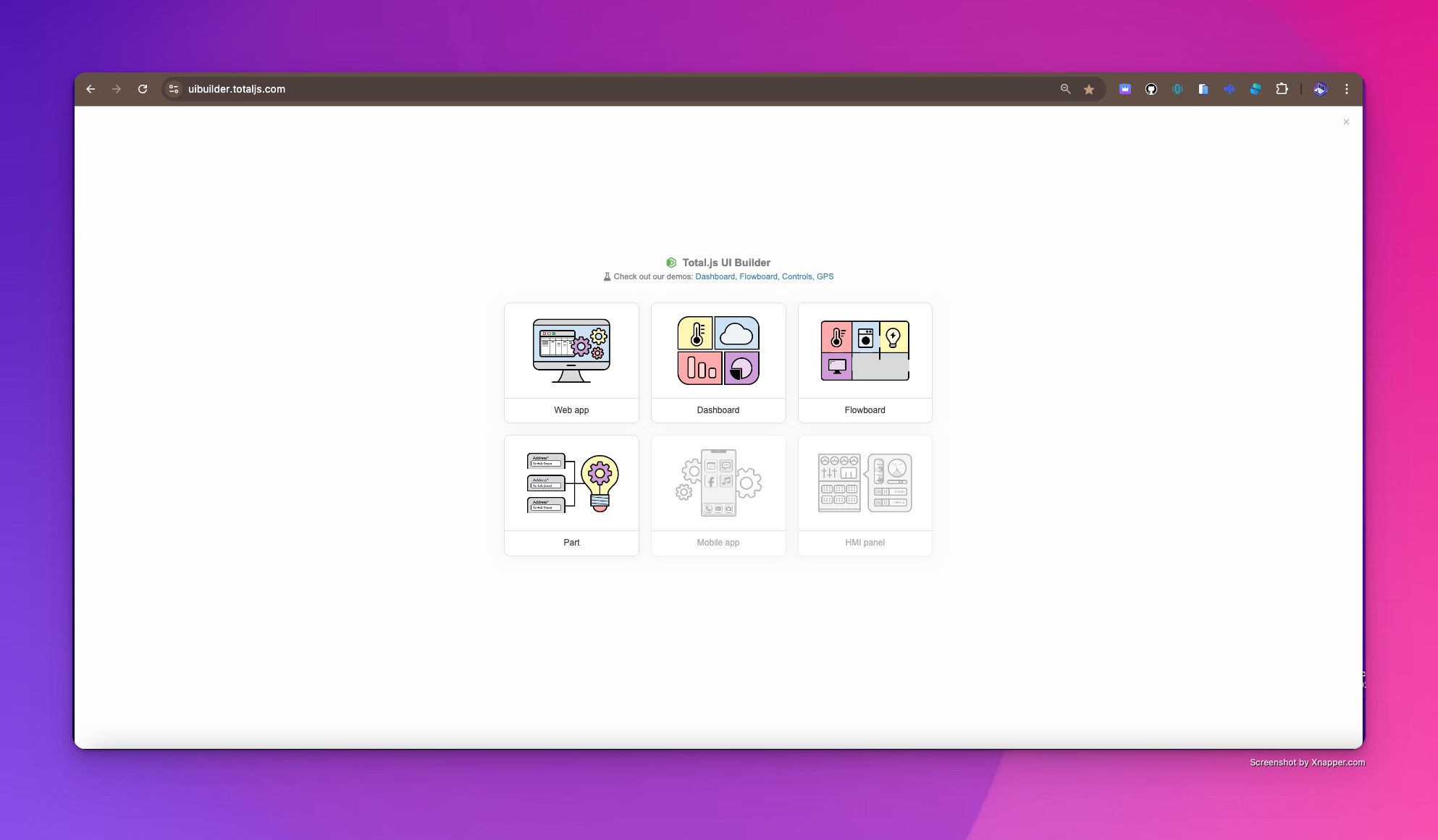
Screenshot of the UI Builder homepage where you can choose the type of project to start.
Step 2: Choosing Your Interface Type
Once you open the page, you’ll be asked to select the type of interface you want to create. The available options are:
- Web App
- Dashboard
- Flowboard
- Part
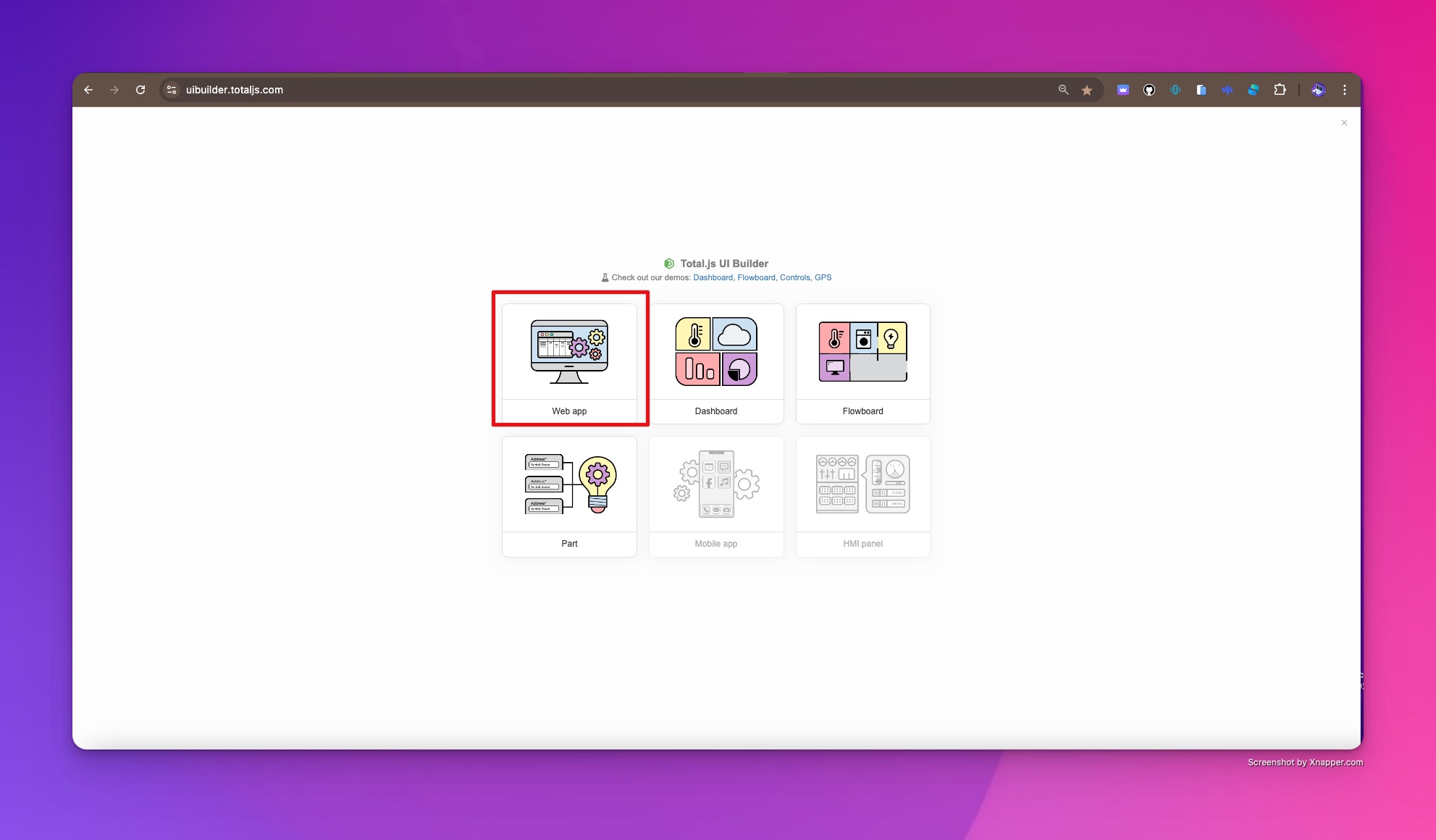
Choose your project type in Total.js UI Builder.
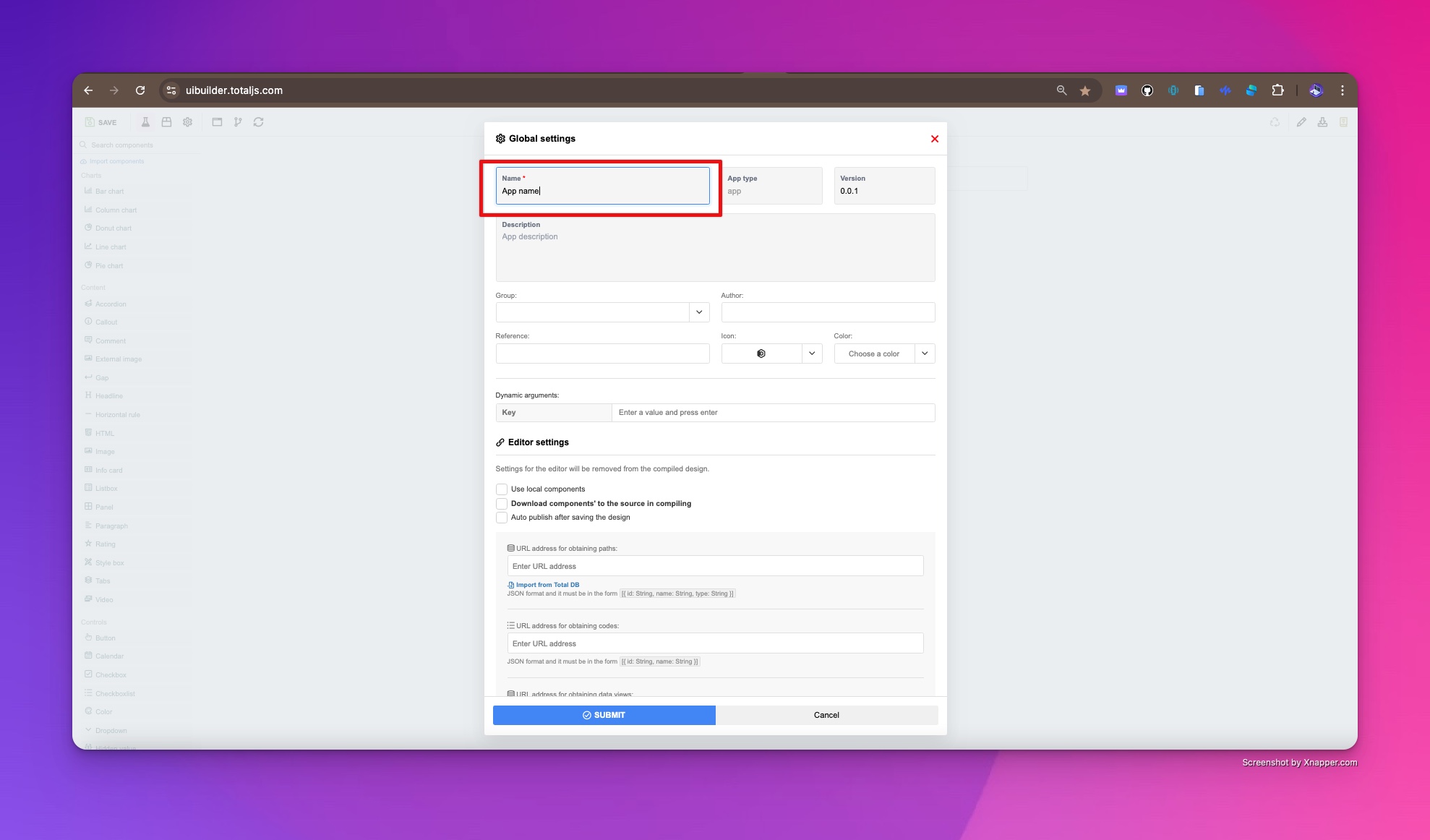
Some options, like Mobile App and HMI Panel, are coming soon, but for this tutorial, we’ll focus on Web App. Once selected, you’ll be prompted to give your app a name. There are many other fields available, but for now, just change the App Name and leave everything else at its default.
Step 3: Exploring the UI Builder Editor
With your project created, you’ll be taken to the UI Builder Editor. At first glance, it might seem empty, but you’ll soon start filling it with components. Let’s break down the main parts of the editor interface:
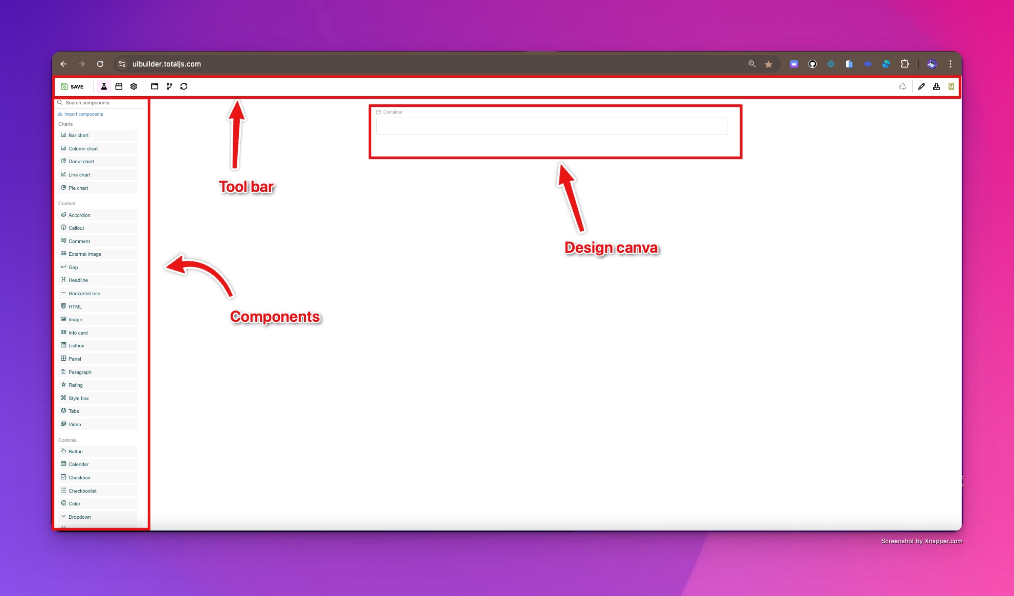
The UI Builder interface after creating a new project.
1. The Toolbar
At the top of the screen, the toolbar provides essential controls:
- Save, Preview, and Publish your app
- Global Settings for configuration
- Display settings for different devices (large, medium, tablet)
- A panel for Inputs/Outputs to manage component signals
- Buttons for reloading components, downloading source code, and viewing documentation.
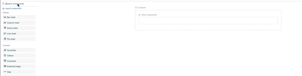
2. The Components Sidebar
On the left, you’ll see a search bar, an Import Components button, and a list of imported components. You’ll use this sidebar to find and drag components into your workspace.
3. The Canvas
The canvas is where you’ll design your interface by dragging and dropping components. It adapts to the display type you’ve selected, allowing you to see how your UI looks on different devices. By default, it uses your current device’s display.
Step 4: Building Your “Hello World” UI
Now, let’s get hands-on by building a simple interface that displays “Hello World” when a button is clicked. We’ll be using four components:
- In the Components Sidebar, use the search bar to drag and drop the following components onto the Canvas:
- Input component
- Headline component
- Show Components component
- Button component
Adding components to the canvas in UI Builder.
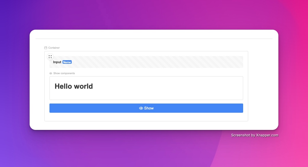
- Nest the Headline Component
Drag the Headline component inside the Show Components component. This will ensure the “Hello World” message is controlled by the button click.
- Customize the Headline Text
Click on the Headline component to edit the default text, then type “Hello World”.
- Preview Your Work
Click the Preview button in the toolbar to see how your interface looks. At this stage, you’ll see the button, but the Hello World message is still hidden, and clicking the button won’t do anything yet. That’s because we haven’t configured the components yet.
Step 5: Configuring the Components
Every component you add has customizable settings. To access these settings, right-click on any component and select Settings. Let’s configure each of our components step by step:
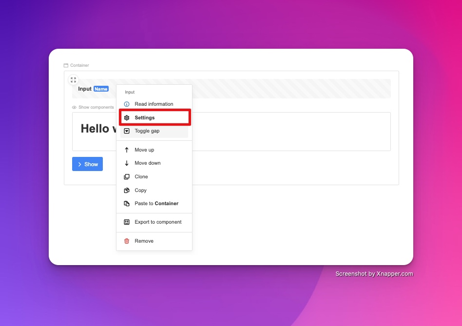
1. Configuring the Button Component.
Open the settings pane
- Right-click on the Button component and open the Settings panel.
- Change its Display Name to “Show.”
- Set the Size to “Large” and add an Eye icon to indicate visibility.
- In the Input field, select the Input component. This step allows the button to send a signal when clicked.
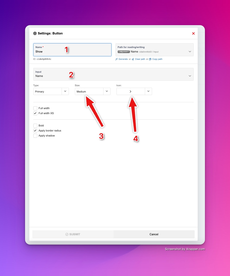
Configuring the button component settings.
2. Configuring the Show Components Component
- Open the Settings for the Show Components.
- In the Read/Write field, choose the Input component to ensure that the “Hello World” message is shown when the button is clicked.
3. Configuring the Input Component
- No major changes are needed here, but feel free to rename the Input component for clarity. The input serves as a link between the button and the display of the “Hello World” message.
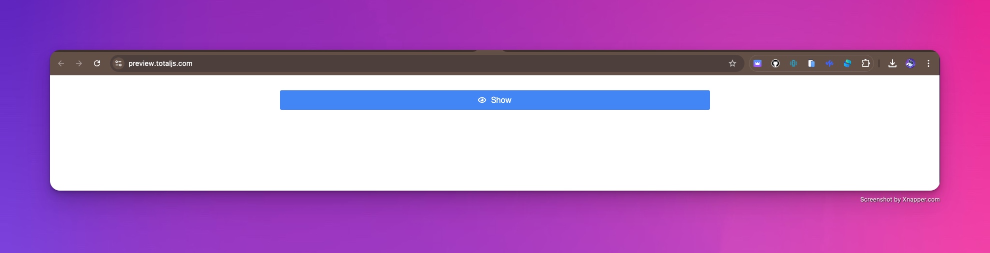
Step 6: Testing Your UI
With all the components configured, it’s time to see the magic happen. Click Preview again, and this time, when you press the “Show” button, the Hello World message should appear on the screen.
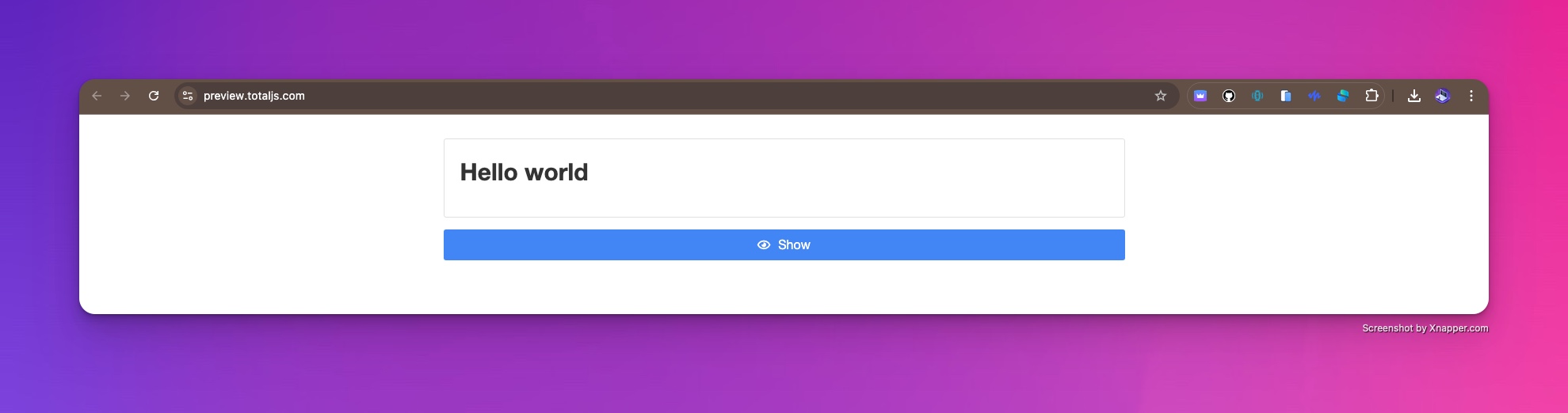
Previewing the UI after clicking the Show button.
Congratulations! You’ve successfully built a basic interactive UI using Total.js UI Builder!
Step 7: An Exercise for You
Now that you’ve created your first working UI, let’s take it a step further. You may have noticed that after clicking the button, the message stays visible, and there’s no way to hide it.
Here’s a challenge for you: Try adding a second button that will hide the “Hello World” message when clicked. You can configure it similarly to the first button but reverse the functionality. Give it a try, and we’ll review more advanced features in the next post.
In just a few steps, you’ve gone from an empty canvas to building a functional user interface. Stay tuned for the next post, where we’ll dive deeper into advanced UI components and interactivity with Total.js UI Builder!
Other posts from Total.js Platform
- 2026-04-01NEWMarch report 2026
- 2026-03-02February report 2026
- 2026-02-02January report 2026
- 2026-01-02December report 2025
- 2025-12-15Totally Merry Christmas and a Happy New Year 2026!
- 2025-12-01November report 2025
- 2025-11-02October report 2025
- 2025-10-22New universal drivers for IoT Platform
- 2025-10-13IoT Platform Update: New Features and Enhancements
- 2025-10-01September report 2025